Tuesday, June 30, 2009

Squares and stripes

First of all...bear with me. This is my sister dancing with Donnie. (About 30 seconds in.)

Warning: Turn down the volume unless you are a fan. Lots and lots and LOTS of screaming:

http://www.youtube.com/watch?v=Z7Qth0Rp0Jo

Sniff. I'm so proud!! Oddly enough, she was only up there for 20 seconds or so. It felt like four minutes while we were there. This is a good thing, because it means I was only standing there frozen like a total dweeb for less than a minute. Good stuff.

OK, so let's move on. The long awaited squares and stripes post, which works well for this time of year (stars and stripes...get it??). It's really not rocket science, and yet again, there will collective "DUH." when you're done reading, but I like to share so I'm sharing. OK? OK.
First, the squares. The two items you must have for squares and stripes is a level (either the one below or a laser level that sends a beam of light straight down the wall) and blue painters tape. For this wall, I used two inch painters tape for the whole wall. I used the white wall as the background, but if you want a color, you'll need to paint it that color first.
Then, the measurements all depend on the size of squares that you want, or how many rows/columns you want. Say your wall is 127 inches -- and you want six columns of squares. You'll subtract two inches for each end of the wall, and each two inch space between each column -- basically each spot the painters tape will go.

Like this:
127 inch wall
six columns equals seven two inch sections (on each end of the wall and between each column)
7 sections x 2 inches (for painters tape)=14 inches
127 inches - 14 inches= 115 inches
Now divide 115 by six (for six columns)= each column would be 19.16 inches wide.

Do the same for the rows up and down as well. I know I made this seem complicated and it's really not that bad. It may take you a few tries to get the right measurements -- it did me. The rest is easy, it just takes time.

I hope that made sense! After you've figured out your measurements, you'll just need to measure off your wall. I use a yard stick, with the measurement marked, and I keep moving it down the wall, marking, say, 19.16 inches up and down the wall. Then take the level and use it to make straight lines on the wall vertically and horizontally.

Take your blue painters tape and run it along the lines. You can use the laser level and put the paint along the laser line, (this is how I do it) or you can put a light pencil line down the wall and then tape that off. To make sure no paint bleeds under the tape, I've heard many tricks, but all I do is take my thumbnail and run it down each side of the tape. You can also use a credit card or pan scraper. It works every time for me.

For stripes, my little trick is to use the yard stick again. In our son's room, I wanted the stripes in different widths -- two, seven, three and five inches. I did all the painting before the chair rail was put up, so the top of the stripes doesn't have to be perfect. Before I started, I marked the measurements and colors on my yard stick, and then used the painter's tape to hang the yard stick on the wall:


Using the marks on the yard stick, I used the level and painters tape to put the stripes down the wall. With stripes, you can't do all of them at once. My wall was cream, so that stripe was done. I had to paint three other colors, so I did the dark and medium green first, let it dry (I did NOT wait as long as they recommend and you don't need to) and did a quick second coat. Then I pulled off the tape and the next day did the third, lightest green by reapplying painters tape on each side of that stripe and painting:
Of course, the more colors, the longer it takes. It seems complicated and again, it's not. The great thing about varying stripes is you don't have to measure the wall like with squares. Just figure out what look you want and go. Once you get going, it will go surprisingly fast. Surprisingly. Swear. Pinky swear.

I taped off most of the stripes in my son's room within a couple hours, and the total paint time was probably a few hours.

I did stripes on one wall in our bedroom as well:
This was done by just painting the wall the base color, then taping off one foot columns and painting a shimmer glaze over the base. It's a really subtle look and I absolutely love it.

My biggest tip when using painters tape -- take the tape off when the paint is still damp if at all possible!! I've heard from professionals to keep it on till the paint is dry, but when I've done that, it makes a mess. The lines turn out awful, because the tape pulls up little pieces of the paint. When it's damp the tape comes right off, leaving a clean line.

If you have any other tips for a clean line or painting stripes/squares, please leave them in the comments! I know many of you have textured walls and I know it can be done, I've just never tried it. ;) I appreciate any other thoughts!!

It takes some patience, but the result is so custom and beautiful, you won't regret it!

P.S. I went to the best antiques shop in Indiana today and whoooeee, I have some eye candy for you later this week!! If you follow me on Twitter, you have already seen some of them. Fabulous!!!

I'm So Excited!!!!

I just ordered our new dining room chandelier!!! It's made from coconut beads and is half off at Anthropologie. It reminds me a bit of Nina Griscom's ($5000) branchelier:


Obviously that's a bit out of our price range... ;) When my friends gave me a gift card for my birthday, I found the coco-bead chandlier & was in love. To be honest, few people in my "real life" seem to like this chandelier, but I was hoping you design divas would "get it." ;) ;) hahaha

Anyway, I'll be posting pics when it arrives!!

xoxo,

lauren

Otra "puerta biblioteca" de madera

Diseño
Muchas Gracias: Aquí mando las fotos de la puerta-biblioteca que me hizo un carpintero amigo gracias a la idea que vi en la pagina A todos los que la ven les parece muy buena y practica. Gracias. Liliana.

Para ampliar información y ver fotos de puertas siga el vínculo, encontrará una lista de posteos ordenados para su fácil revisión.

Puerta cerrada
Puerta biblioteca cerrada
Puerta cerrada terminada y abierta sin terminar.

Puerta abierta
Puerta biblioteca abierta
En la siguiente tabla hay links a otros posteos elegidos que son relevantes para este porque muestran soluciones para el hogar.


Relacionados:
- Sobre la puerta biblioteca
- Puerta estilo Art Decó
- Puertas italianas
- Diseño puertas modulares biblioteca

Por favor, deje su opinión por escrito en un comentario al pie. Agregue este blog de arquitectura de casas a su lista de Favoritos. Para recibir novedades por email inserte su dirección de correo electrónico en la ventana de la barra lateral. Más abajo hay una breve encuesta muy fácil de responder con un clic, sirve para orientar la publicación de los contenidos según su motivación e intereses. Gracias por participar.

Monday, June 29, 2009

Salamandra de hierro y vidrio

Calefacción
Salamandra Filfer Super Vitro. Construida con fundición de hierro y vidrio temocerámico en la puerta. Permite disfrutar de la vista del los leños ardiendo. Altura 69cm, Ancho 57cm, Profundidad 42cm, 10Kg de carga de leña. Visite el sitio web www.sorrentinopatagonia.com - Argentina.

Para ver alternativas para calefaccionar su hogar siga este vínculo, encontrará una lista de posteos relevantes.

Salamandra
Salamandra de hierro y vidrio
Más equipamiento y calefacción para la casa en los vínculos de la tabla a continuación.


Relacionados:
- Estufa de leña y madera
- Radiador de cristal
- Agua caliente central
- Hogar de leños
- Calefactor de llama virtual

Por favor, vuelque su opinión por escrito en un comentario al pie. Agregue este blog de arquitectura de casas a su lista de Favoritos. Para recibir novedades por email inserte su dirección de correo electrónico en la ventana de la barra lateral. Más abajo hay una simple y breve encuesta muy fácil de responder, sirve para orientar la publicación de los contenidos según su motivación e intereses. Gracias por participar.

Salamandra de hierro y vidrio

Calefacción
Salamandra Filfer Super Vitro. Construida con fundición de hierro y vidrio temocerámico en la puerta. Permite disfrutar de la vista del los leños ardiendo. Altura 69cm, Ancho 57cm, Profundidad 42cm, 10Kg de carga de leña. Visite el sitio web www.sorrentinopatagonia.com - Argentina.

Para ver alternativas para calefaccionar su hogar siga este vínculo, encontrará una lista de posteos relevantes.

Salamandra
Salamandra de hierro y vidrio
Más equipamiento y calefacción para la casa en los vínculos de la tabla a continuación.


Relacionados:
- Estufa de leña y madera
- Radiador de cristal
- Agua caliente central
- Hogar de leños
- Calefactor de llama virtual

Por favor, vuelque su opinión por escrito en un comentario al pie. Agregue este blog de arquitectura de casas a su lista de Favoritos. Para recibir novedades por email inserte su dirección de correo electrónico en la ventana de la barra lateral. Más abajo hay una simple y breve encuesta muy fácil de responder, sirve para orientar la publicación de los contenidos según su motivación e intereses. Gracias por participar.

It. was. awesome.

Oh my goodness people. I cannot even tell you how. much. fun. we had last night. I'm not even kidding. It was the time of my life!!! First, some pictures, and then you'll just die at the story at the end!!!!

Our seats were AWESOME, thanks to a former coworker of my sister/second cousin of my best friend (long story). We were right behind the sound stage. Thank God I'm 11 feet tall:

I kept standing on the railing around the sound stage, making me about twelve feet tall. The security guys were giving me the stink eye and a stern "GET. DOWN." look quite often. Whateva dudes. I waited 18 years for this:
Jared the Subway guy knew someone in the band and sat right in front of us. My goober adorable best friend and sister got pictures with him:
We went ALL OUT and got a limo -- here's a few shots. Me and my sis:
My hawty hawt shoes:
(Yes. I have blisters.)
My and my BFF. We've been best friends for about 23 years. Five NK's concerts together, and I wouldn't want to go with anyone else:
And a self portrait with the massive crowd behind us!!
So GET THIS. Before the show, my BF is Twittering Donnie (to my fellow twitterers (?) I'm sorry for the goofy posts last night!) and just to be funny, I twitter him our section, row and seats and tell him to come out to see us (we heard earlier that they come out in the crowd.)

Later in the show, the lights go down and all the sudden the guys are all spread out in the crowd. Donnie is immediately to our right, about five feet away. My sis and BF are over there in two seconds. I turn around and Joe is to my left, about five feet away as well. The seas parted and crazed girls grown women went screaming to each side of me. I stood like a goofball right smack in the middle, by myself, freaking out -- which way to go???

I was frozen. I couldn't decide. (Ladies, they were both smokin' hot. Smokin'.) I look over to the right at Donnie and there's this cute chick dancing with him, and I'm like, oh, she's cute! Oh, I hate her. Oh, she's cute though. But oh wait, look, there's Joe! Right there. Geez, that girl is still dancing with Donnie! I still don't know which way to go. Frozen.

I look over again...it hits me....
MY SISTER IS DANCING WITH DONNIE WAHLBERG. Wait. What? MY SISTER IS DANCING WITH DONNIE WAHLBERG!!!!!!!!!!!!!!!!!!!!!!!!!!!!!!!!!!!!!!!!!!!!!!

It was the most surreal experience of my life. I run over there, get on a chair and am about three feet from Donnie, eye level....

And I don't have a camera. Nothing. My phone had long died, I didn't bring in my camera, I had no idea where the other cameras were. I could have gotten the most amazing pictures of Joe and Donnie if I had one. I am hating myself right now!!

I don't even know if they get twitters from fans, but we thought it was so odd that he ended up right next to us. :) It was fantastic. My best friend has been a Donnie fan for 20 years and held his hand. We felt like we were 15 again, only better. :) It was the best concert I've ever been to, hands down. There are only about ten more concerts -- if you are not sure about going -- you MUST. You won't regret it. They know how to entertain!!

Thanks for letting me gush!! I feel like you are all my friends, so I had to share the night with you! And a big thanks to those of you who could care less about former teeny boppers for putting up with me lately. I swear, no more about it -- back to painting, crafting, decorating....I promise. :)

Decoración de baño - USA

Inspiración
Otra imagen para su inspiración, es de un baño en los EEUU (Bahia de San Francisco). Combinación de colores (Marrón, blanco y celeste) y diseño decorativo. Visto en Apartmenttherapy.com Para revisar información sobre baños siga el vínculo, hay una lista de posteos relevantes.

Baño decorado
Revise otros posteos sobre equipamiento y decoración de baños, siga los links en la tabla a continuación.


Relacionados:
- Baño + diseño
- Baño y madera
- Decoración baños
- Vanitory de baños
- Accesorios de cerámica para el baño


Por favor, deje su comentario al pie. Si aun no lo hizo, agregue este blog de arquitectura a su lista de Favoritos. Para recibir novedades por correo electrónico, inserte su dirección email en la ventana de la barra lateral. Más abajo hay una breve encuesta muy simple de responder con un clic, sirve para orientar los contenidos según sus motivaciones e intereses. Gracias por su participación.

Tips for Taking Interior Photographs (non-technical!!)

I received a bunch of emails after my last post asking about tips for taking "after" pics of rooms, so I thought I'd share some that I've discovered over the years. (I am by NO MEANS a professional as you can tell though!! ) Since so many of us are obsessed with getting our houses looking pretty & have blogs, I figured it couldn't hurt! A lot of these might sound like no-brainers, but I really had no clue about them when I started.

1) Don't use flash. Here are a some of 'before and after' pics of our old house, where we moved just after the apartment, the townhouse. I took them when we first moved in, but some of the 'afters' are from a year or 2 later. Here are a couple of "flash" photos:

Images with flash end up being dark & cold & cheap-looking. (above & below)
Now, check out the "after" (below). It's light & airy and much better:
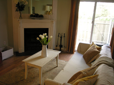
2) Shoot during the day when the lighting is good. (Unless you're specifically after nighttime shots like a Christmas tree at night or candles or something special like a city view.) Here is our living room when we first moved in. (With all of my lovely decor from my old apartment... eeeeeek) I didn't use flash on it even though it was taken at night: (which is good)

But check out the difference in the same room during the day: (no flash of course)
3) This one really should have been a no-brainer for me (but it wasn't!)... You should "style" the space. (ok, #1 clear out clutter... I think in the pic below that I must've just been trying to get a shot of the pretty roses from my husband -- not trying to get a room shot--- but it does illustrate this point perfectly. How can you even notice the flowers when there's junk everywhere?!)

How much prettier do these (below) look? No clutter, no flash... HUGE difference:

Some reminders for styling: ditch items like wastebaskets, newspapers... Hide your electrical cords. Tape them to the underside & down the back legs of furniture so you can't see them. Nothing is worse than a tangle of cords.

Styling for the kitchen: Sometimes people actually go too sterile when photographing kitchens. But, remember you can ditch items like your toaster (if it's not cute & takes up too much space), sponges, pot scrubbers, pens & pencils, etc. Consider having a pretty soap dish or dispenser, nice towels, good-looking cooking utensil holder, a bowl of fruit and/ or vase of flowers.


The pictures above & below are from when we sold our house so actually a few things are missing because staging is different from decorating (like the pretty towels & a few things that might warm it up) but we did set up a couple of bottes of Aquafina on the bar, which I always think looks nice. (I love Aquafina bottles & totally refill them with fresh water & stick them back in the fridge!!)

Styling for the Bedroom: Again, some fresh flowers or something pretty on the nightstands. (Even set up some colorful jewelry or books--- anything that's pretty & adds a little something)... Add interest to bedding. Think of Pottery barn and all their layers. Even just a throw at the end of the bed can do the trick.

Show personal, but not-too-personal-items that make the space look lived in: NOT the box of tissues but maybe a cool glass of water in a vintage glass or a pair of glasses on a stack of pretty books..


For living rooms, a lot of the same things apply. Use pretty pillows and interesting accessories. Get rid of any clutter that isn't attractive. Always add fresh flowers or greenery if you have time. You'd be surprised what a huge difference adding flowers/ greenery into the room does. Again, the goal is to make the space look "lived-in" but not cluttered.

Pottery Barn is awesome at styling in my opinion. I might not always be in love with what they're selling but I'm always so impressed with their styling. (above) For dining rooms, make sure there's something beautiful on the table. It doesn't necessarily have to be a set table (which does look gorgeous) but it could be something simple like a pair of lanterns or dinnerware stacked up as if it's about to be set with a little vase of fresh flowers.


Take advantage of tabletops & shelves. Every surface is a change to create something beautiful. It's important to train your eye. Scour catalogs & design magazines & notice all the details that are present & missing. You'll be surprised by how much you can learn & by how good you'll get.


4) Use a tripod or hard surface to set the camera on. I'm really guilty of not following this rule and it shows. This is huge because if you're not using flash, it's really easy for the photo to blur and any movement at all messes the photo up. (Virtually none of the photos I take myself are clear enough, probably because if this!! ok, I know what I need to go buy!!)

5) Leave out any unattractive features in the room from the shot... Depending upon the look/ mood you're going for, this could be anything from the TV, to speakers, to the chair that you just haven't had the time/ money to reupholster yet.


6) Shoot from lots of different angles & take TONS of pics. I'm not a professional photographer so I don't know which angle a shot will look best from so I take them all. This way, I get tons of photos of one room & I have my pick of which shot works best. I'm often surprised that the one I thought would work the best, doesn't. Get low, get high, go straight on... try it all. (You'll eventually get the hang of what usually works best & won't have to always take so many shots but it's good to start out this way to find out what you like. )

7) Figure out the style of photography you like & try to emulate it. There is a HUGE difference between Architectural Digest & Domino. I made the (HUGE!!!) mistake of spending $$$$s on a photographer who did work for Architectural Digest to shoot for my portfolio. His work was amazing, but totally not my style. The photos ended up looking static & serious to me, which was not how I wanted my work coming across at all. The angles were all straight on & I couldn't feel any movement in the room. I was able to use a few shots that I loved, but overall for the amount of money I spent, I was really disappointed. (They're all on my website now & it drives me CRAZY!!! arg!!) But the point is, it was my fault. I didn't have enough knowledge of the style of photography I wanted. If you can figure out what you like, you can immitate it. (country living image below)


So, there you have some info on how to get better interior shots. I know I didn't address any technical issues & that would be because I'm still clueless in that arena!!! (I have yet to read my camera's manual so that might help a bit!) Hope everyone had a great weekend!!!
xoxo,


lauren

Sunday, June 28, 2009

Vivienda de madera escalonada en desnivel

Casa de balcones en escalones.
Este diseño de casa en desnivel sobre una ladera, realizada en madera, tiene características de las que suelen identificar la arquitectura australiana. La edificación está lanzada al borde y todos los ambientes cuentan con abundante luz natural y vistas naturales. Puede verse como una cabaña sofisticada que se integra a ese ambiente con mínimo impacto sobre su suelo.

Foto 1
Hay espacios amplios abiertos y ambientes exteriores con acceso libre para estar dentro y fuera de la casa. La madera aporta un material que armoniza en el entorno.

Foto 2
Estudio de arquitectura Neeson Murcutt Architects L5 71 York Street Sydney 2000 www.neesonmurcutt.com

Foto 3
Plano
Vea otras casas en desnivel y escalonadas, casas del abismo y diseños para terrenos similares.


Relacionados:
- Casa en la ladera de un lago
- Una casa sobre el abismo
- Residencia en una ladera
- Una casa en el aire

 
coompax-digital magazine